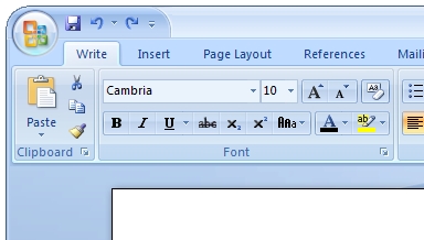
Jensen Harris, who has been working on the Microsoft Office 2007 user interface, explained today that Microsoft showed off the UI at the CeBit technology conference, but for those of us who can’t be there to experience it in person, he’s posted a ton of screenshots on his blog. So far, so good, I have to say-the UI looks absolutely amazing, and I’m specifically sure it’ll fit in with the overall UI design for Windows Vista very very well.
The trouble I see though is that it’s going to cause nightmares for support techs around the world who will have to hold their users’ hands to help them get used to not only a completely different UI from all previous Office versions, but a total paradigm shift in the way you get to the tools and options you need. Luckily for us, it seems like the designers have thought of most of that in advance and put the majority of the tools and tweaks that most users will need right up front on the ribbon (the bar across the top) and allow for heavy customization of the ribbon that should soothe the nerves of some people. But it’ll still be an adjustment for many people.
Even so, it looks absolutely amazing. Head over to his blog to check it out, and keep in mind that it’s not too late to sign up for the Office 2007 beta if you like; the link is on Harris’ blog as well!
[ Jensen Harris: An Office User Interface Blog : Picture This: A New Look For Office ]
